


Narrative cannot instruct mechanics. Mechanics are the rules a system executes when no one is managing.
In 1965, Gui Bonsiepe published the framework at Ulm. Wolff Olins was founded the same year. One path produced Aicher’s Lufthansa: structural rules that governed their own evolution sixty years later. The other normalized narrative tools that cannot generate behavioral rules. The discipline is still paying for it.
Narrative transmits. Structure generates.
“Classical rhetoric, which deals purely with language, is no longer adequate for describing and analysing rhetorical phenomena in which visual and verbal signs, i.e. word and picture, are allied. Here the practice of rhetoric has far outrun its theory.”
Gui Bonsiepe, Ulm Journal, 1965
Mitch Paone, March 2026
Author’s Note
Time Is the Material proposed that identity must be designed through time. Structure Requires Authority documented why the industry’s organizational hierarchy prevents this. This essay addresses what remains: the specific failure mode produced when a transmission format is operated as a generative instrument.
This essay draws on three categories of evidence. The first is public record: published case studies, interviews, documented project histories, and verifiable outcomes cited in the notes. The second is direct project participation: observations from client work at DIA, including Mailchimp. Those observations are grounded in access to production files, briefs, governance processes, and operational constraints that are not publicly available and cannot be independently verified by the reader. The third is generalization: conclusions drawn from a sample of projects that is neither random nor representative. These conditions are stated here because the essay uses insider evidence as proof weight, and measurement integrity requires that the reader know the conditions under which that evidence was collected and selected.
Identity Without Authors
Bonsiepe identified the mechanism in 1965.¹ Every sign operates in two dimensions. The syntactic is the dimension of shape: arrangement, proportion, behavior. The semantic is the dimension of meaning: metaphor, association, interpretation. Narrative methodology operates in the semantic dimension. Identity systems must perform in the syntactic dimension, where components behave. Governing one through the other is a category error.
Consider what happens in practice. A team receives a brief. There is a core idea: “empowering small businesses through creativity.” A positioning statement: “the only marketing platform that combines expertise with personality.” Personality descriptors: smart, absurd, memorable. Tone of voice principles: approachable but never dumbed down, witty but never cruel, confident but never corporate. Values: creativity, authenticity, community. Three designers present three different directions. All three defend their work against the brief. All three are right. The brief cannot choose between them because none of it contains enough information to extract from. An executive creative director decides. The decision is aesthetic, positional, and largely unrepeatable. The brief did not make the decision. The person did. When that person leaves, no one can explain why.
Mailchimp’s own brief for its 2018 identity described the required typeface as “smart but not stuffy, goofy but definitely aced its SATs.”¹⁷ Those are semantic coordinates. They do not specify weight range, vertical metrics, interface performance, or optical behavior at small sizes. Three designers given that brief will draw three different typefaces, each defensible against it. The brief cannot arbitrate between them. A person arbitrates. When that person leaves, the decision cannot be reconstructed from the brief.
Ulm Precedent
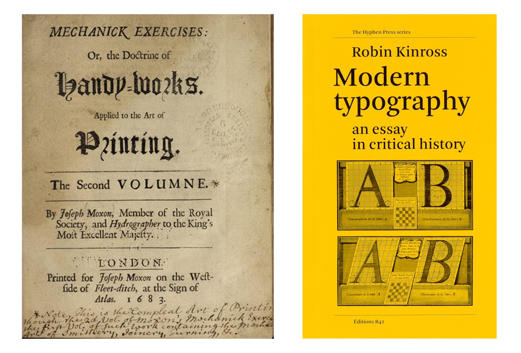
The structural lineage predates Ulm. Joseph Moxon’s Mechanick Exercises (1683),³ the first published manual on printing, defined the typographer not as a tradesman but as an architect of the system: one who, by solid reasoning within himself, can either perform or direct others to perform all operations relating to typography. The typographer authors the logic once. The logic governs output without the author present. Robin Kinross traces this as the origin of modern typography itself: the moment craft became transferable instruction.⁴ Anthony Froshaug, whose typographic practice operated within that same tradition, taught at Ulm from 1957 to 1961 and laid out the school’s journal.⁵ Ulm did not originate the structural methodology. It formalized it as a curriculum and gave it institutional form at the moment the discipline was industrializing.
Tomás Maldonado integrated cybernetics, semiotics, and systems theory into Ulm’s curriculum as operational principles. Before cybernetics, design was supervised output: quality depended on a person with authority being present to approve each execution. When they left, the system drifted. Cybernetics replaced external supervision with internal rules. The designer authors the rules. The rules govern the output without the author present. The difference in stewardship cost is measurable: narrative systems require an interpreter at every decision point; structural systems require only that the rules be protected.
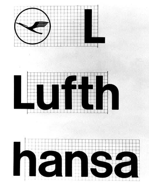
Otl Aicher translated that into practice. His Lufthansa program, begun in 1962,⁶ was a grid, a geometry, a typographic discipline: measurable relationships governing how the identity behaved. Every component derived from repeatable structure rather than individual judgment. Aicher described the methodology as disciplined freedom: rules that constrain execution while leaving application open.⁷
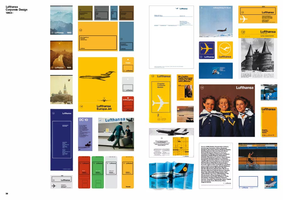
The methodology produced durability wherever design authority operated at organizational scale. IBM under Eliot Noyes—Paul Rand, Charles Eames, Eero Saarinen, George Nelson. Braun under Rams. Apple under Ive. Structure Requires Authority documents how that alignment was built and why it was dismantled. What replaced it was narrative methodology: legible to marketing, defensible to boards, incapable of governing behavior.
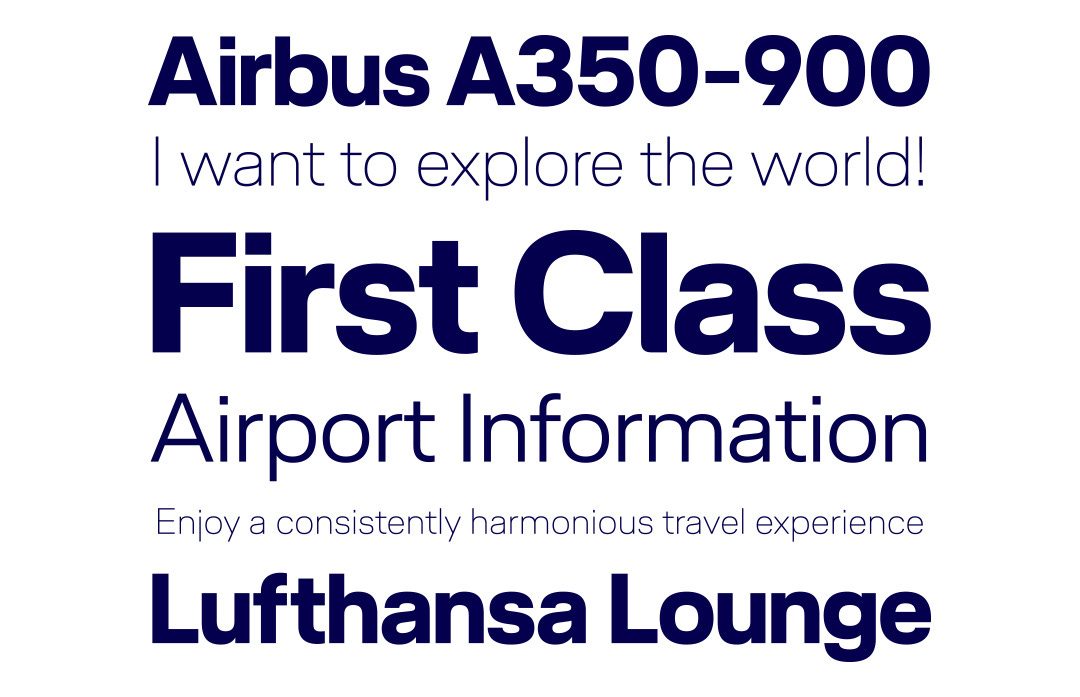
Lufthansa’s identity was updated in 2018. Martin et Karczinski led the relaunch. HvD Fonts designed a custom typeface to replace Helvetica.⁸ HvD began with the existing logotype: counter forms between the ‘s’ and the ‘a’, the characteristic skyline of ascenders, horizontal stroke emphasis. They built a system with optical sizes for livery and screen. Aicher’s rules were replaced. His methodology was not. A different team, fifty-five years later, used the same structural approach to extend the system.
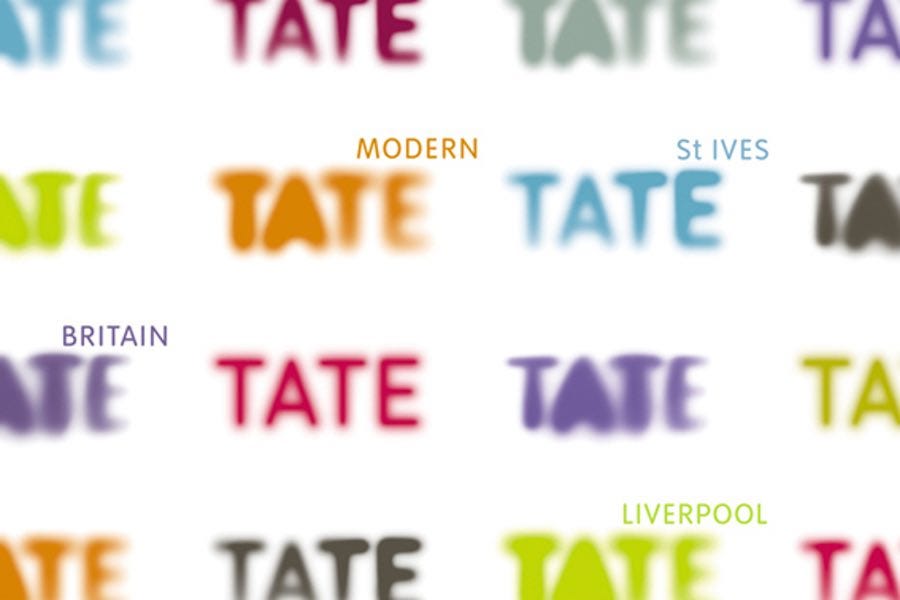
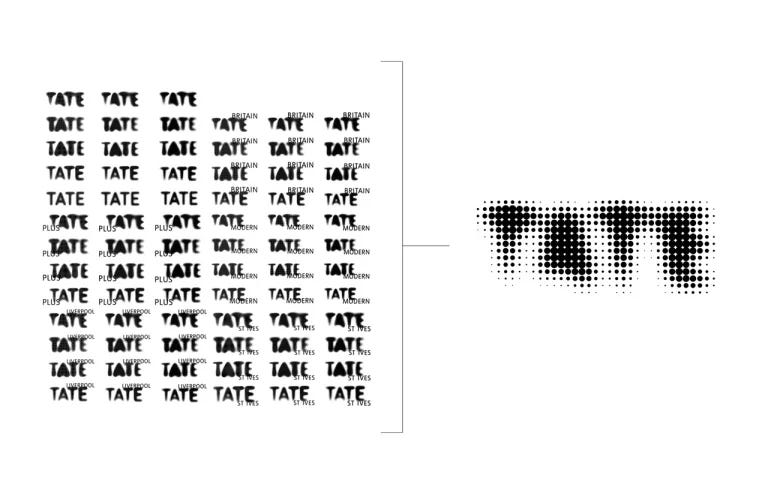
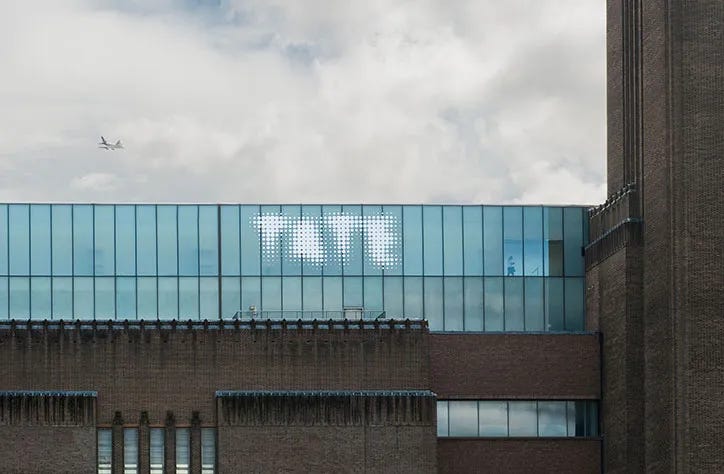
Wolff Olins built the Tate identity in 2000 around a single idea: “look again, think again.” The concept produced seventy-five logo variations with no behavioral rules governing how they should be used.⁹ No formal guidelines on grids, colours, positions, sizes, or formats were provided to the in-house team. The team had been struggling with consistency for years. Sixteen years later, North was hired to impose the structure that should have been built first
Wally
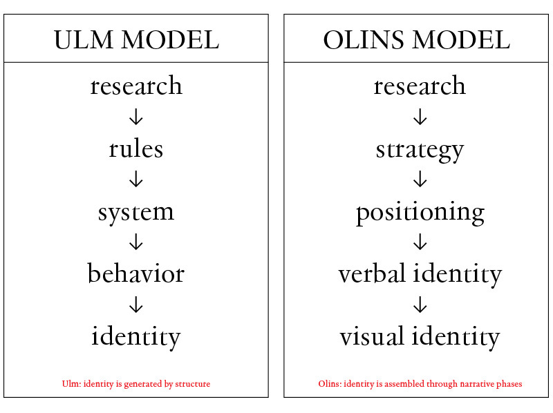
Several conditions shifted the industry toward narrative methodology through the 1970s and 1980s. Interpublic Group became the first marketing services holding company in 1961, establishing the model of consolidating agencies under financial ownership.²⁰ Omnicom formed in 1986 through the merger of BBDO, DDB, and Needham Harper Worldwide. WPP began its acquisition strategy in 1985 under Martin Sorrell.²¹ Holding company ownership rewarded deliverables that could be replicated across accounts and billed as discrete phases. Research, strategy, positioning, verbal identity, visual identity: each scoped, scheduled, invoiced, and signed off independently. Structural rules cannot be separated this way. They emerge through iteration. The interdependencies between phases cannot be resolved in sequence without losing the system. A holding company cannot bill for iteration. It can bill for deliverables. The financial structure selected against the only process that produces structural rules.
Wolff Olins is the recognized face of that pattern. Wally studied history at Oxford, then ran Ogilvy and Mather in Mumbai for five years.¹⁰ He co-founded Wolff Olins with Michael Wolff, a designer, in 1965. Wolff was the design practitioner; Olins was the strategist. Wolff left in 1983.¹¹ The firm retained its strategist and lost its designer. Wolff’s account of the dynamic: “The creativity becomes subservient to the profitability.”¹² Omnicom acquired the firm in 2001 for an estimated £30m.¹³ The trajectory from independent design practice to holding company acquisition is not specific to Wolff Olins. It describes the consolidation of the industry.
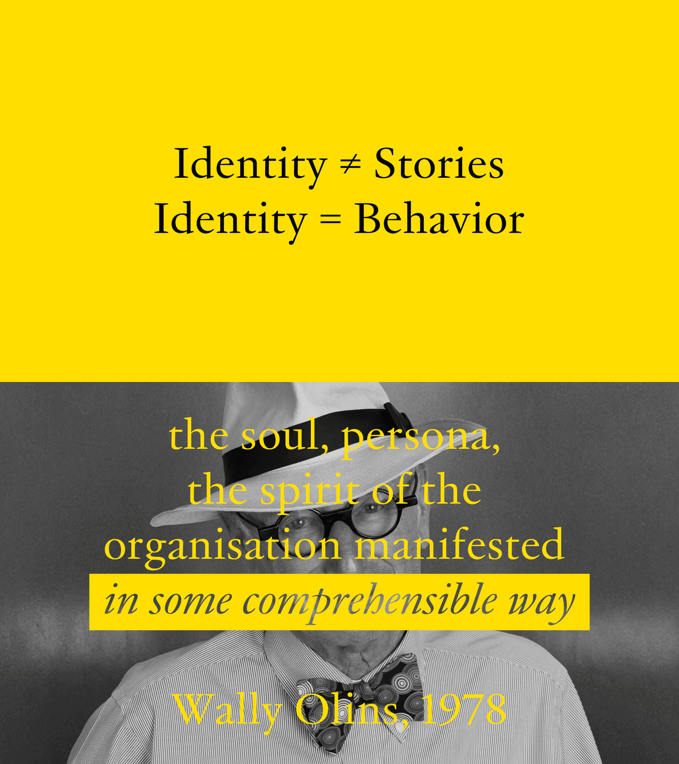
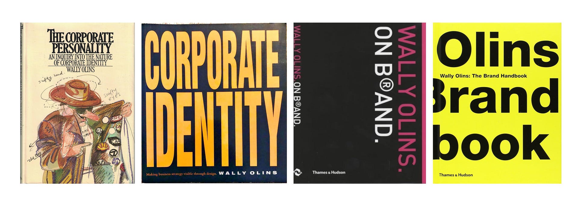
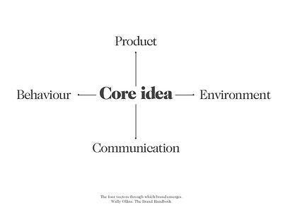
The methodology he sold was the one he wrote. “The soul, persona, the spirit of the organisation manifested in some comprehensible way.”¹⁶ No measurable property. No mechanism. Corporate Identity (1989), On Brand (2003),¹⁴ and The Brand Handbook (2008)¹⁵ reframed the same claim for successive audiences: organizational leaders, then brand managers, then practitioners. Three decades. No mechanism added. The four vectors (product, environment, communication, behaviour) name every surface identity touches. None specify how identity performs on any of them.
Narrative methodology is also easier to evaluate without structural literacy. An executive can assess whether a positioning statement is coherent. They cannot assess whether a type system will hold across interface contexts they have not yet seen. The methodology that could be judged by the client was the methodology that got commissioned.
The Evidence
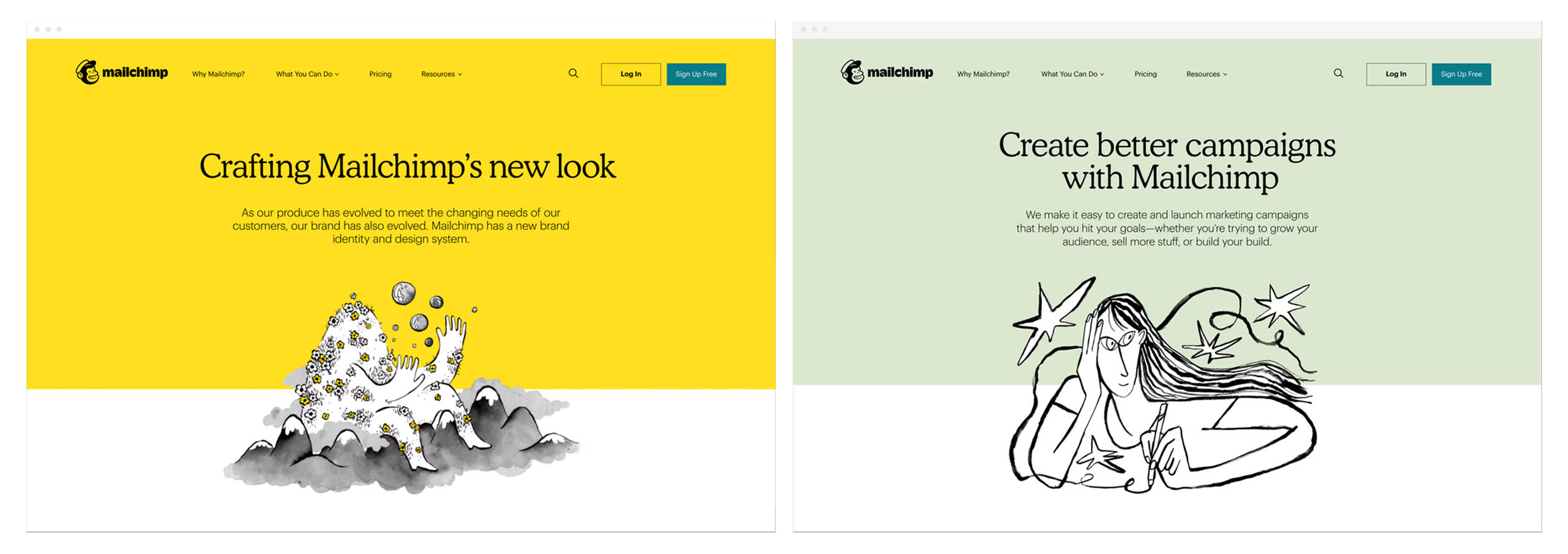
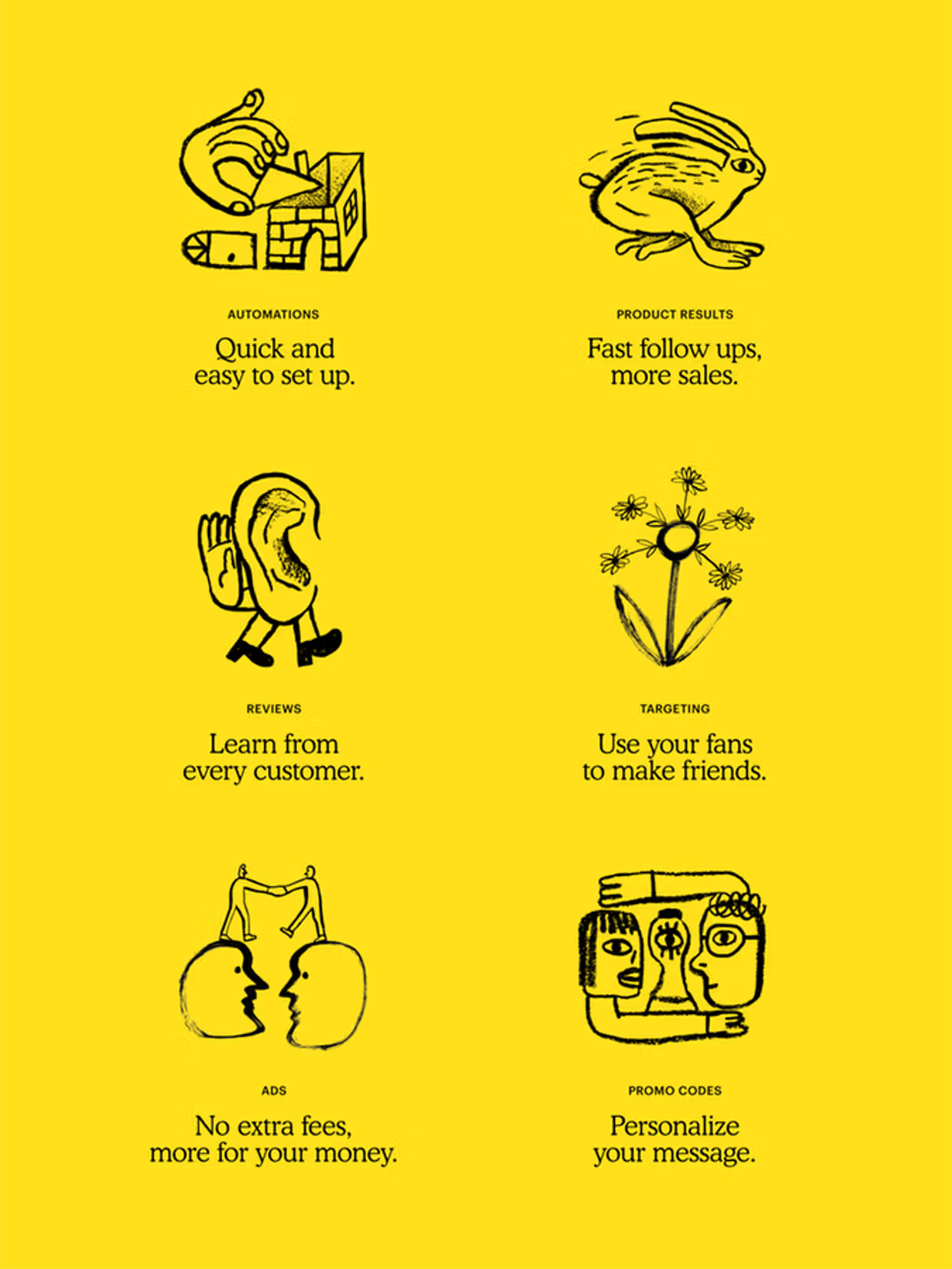
Mailchimp launched a rebrand in 2018. The original work was celebrated. The illustration system was expressive and distinctive. The typography was a bold departure from tech defaults. Press coverage was extensive. As a marketing moment, it worked. What follows is a methodological diagnosis, not a critique of the work or the people who made it. I use this example because DIA worked on the structural correction and can document the diagnosis precisely, not because the failure is unique. Mailchimp is not a marketing campaign. It is a SaaS platform used by millions across onboarding flows, dashboards, notifications, and interfaces its authors never touch directly. Identity at that scale is not a marketing launch. It is a system that has to govern itself. The identity had no structural substrate connecting brand and product. Cooper Light, a single-weight novelty revival, was the primary typeface for a SaaS platform operating across onboarding, dashboards, notifications, and marketing. It had a limited weight range, no interface capability, and no vertical metric compatibility with the secondary typeface. Mailchimp commissioned Commercial Type to design a replacement. The Means project began at the end of 2019, one year after launch.
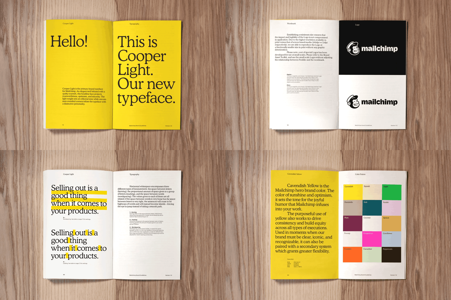
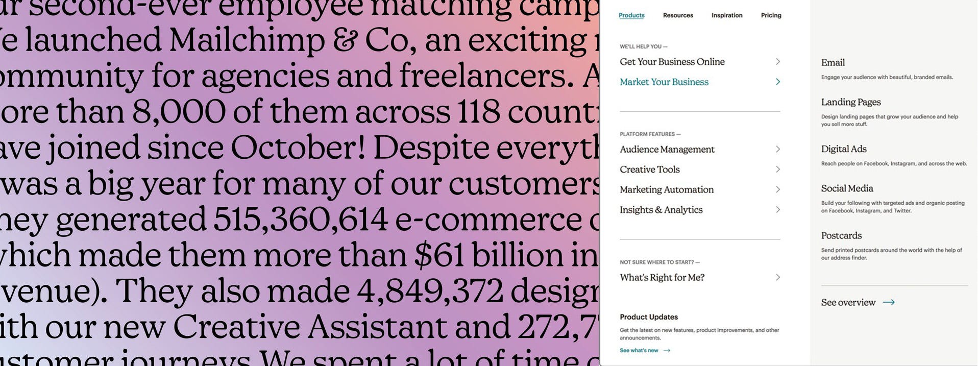
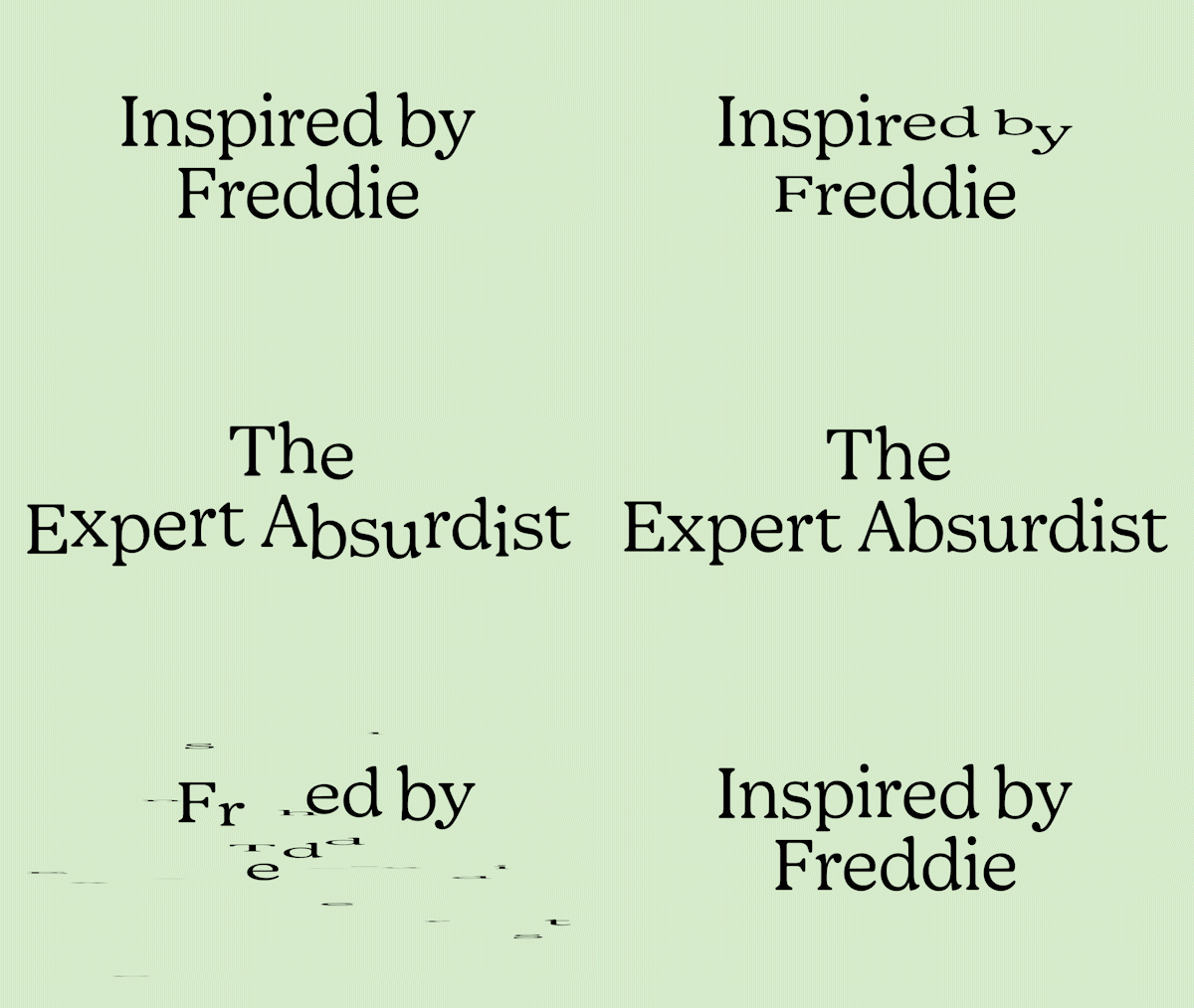
Commercial Type did not begin with the brief. Greg Gazdowicz began with Cooper’s full output as a type designer, using Cooper Black as the structural ancestor: shared roundness in the stems and bowl axes, redesigned with tighter serifs and higher contrast in heavier weights, figure proportions updated for contemporary use. Christian Schwartz chose Goudy for the italics—specifically Goudy Oldstyle—because wandering slant angles from letter to letter would carry absurdist energy as a structural property. Vertical proportions designed for compatibility with Graphik, the secondary typeface. The semantic brief required structural translation before a single letterform could be drawn. Commercial Type performed that translation. The original identity methodology had not.
DIA’s engagement began after the typeface correction was already underway. Brand and product operated as parallel systems with no shared rules between them. The illustration system was removed: single-style dependency, not replicable at scale, not functional as a structural layer.

Freddie and the yellow both predate the 2018 rebrand. The timeline from 2001 to 2018 shows continuous reduction of Freddie toward structural essentials; the yellow is present from 2005. Neither asset had its governing rules extracted. DIA built from those assets: typography unified across brand and product; a procedural motion system deriving behavior from Freddie’s silhouette. Because Freddie is a primate, the system encoded a specific timing curve: pronounced ease-in and release, replicating primate movement physics. Every animator executed the same rule. The sound system used the same physics: fast onset, gradual decay. One biomechanical property. Two sensory outputs. Outlines, framing devices, and transitions extracted from the logo’s outlined form and the curves of the new typeface. Sequential corrections as each layer of structural weakness surfaced under operational pressure.
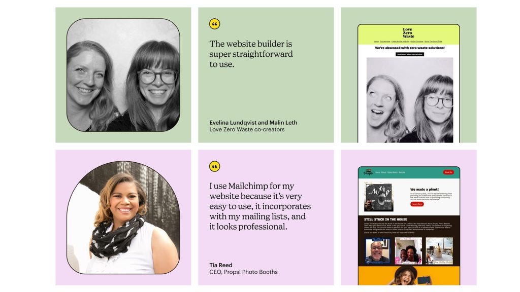
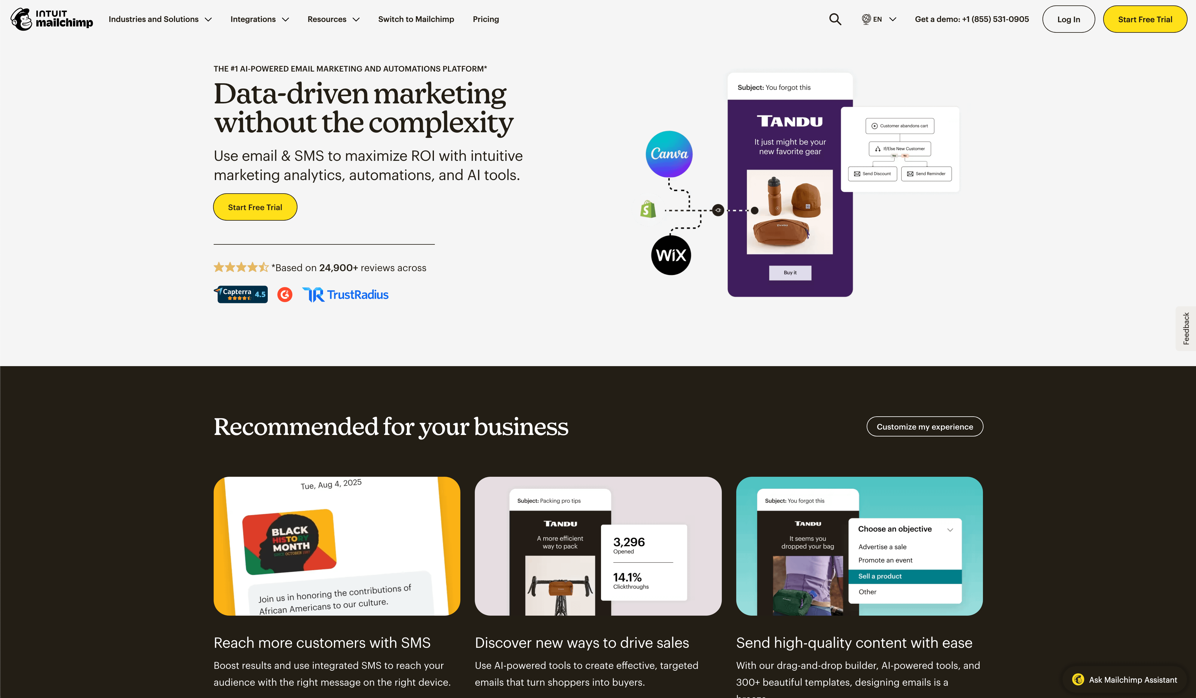
By 2023, Wink Creative, Mailchimp’s internal team, was named Ad Age’s In-House Agency of the Year, producing over 4,500 pieces of work.¹⁸ The structural system was built after the fact, by different hands, under operational pressure.
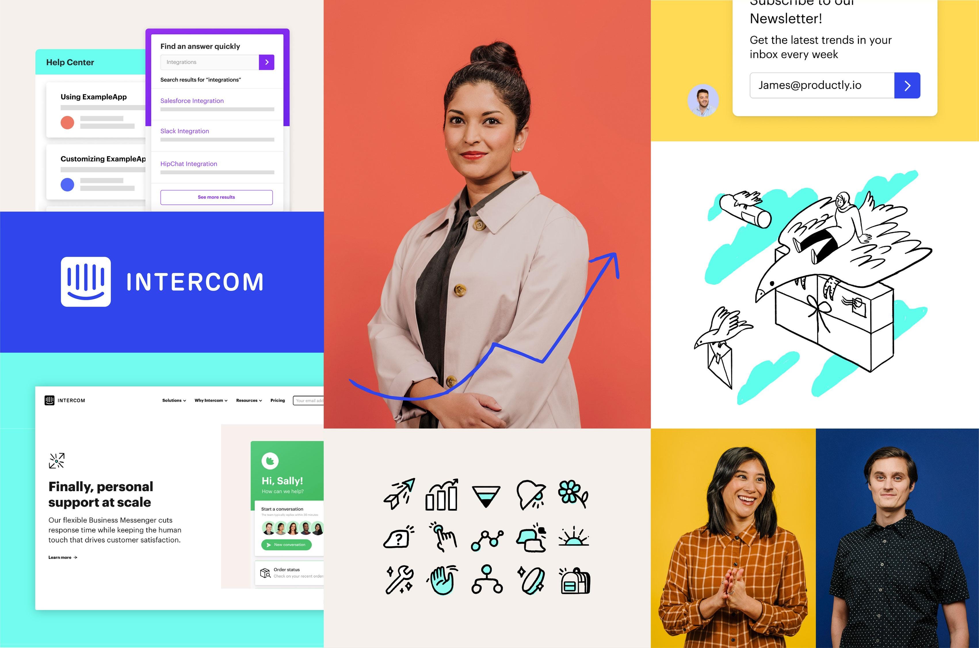
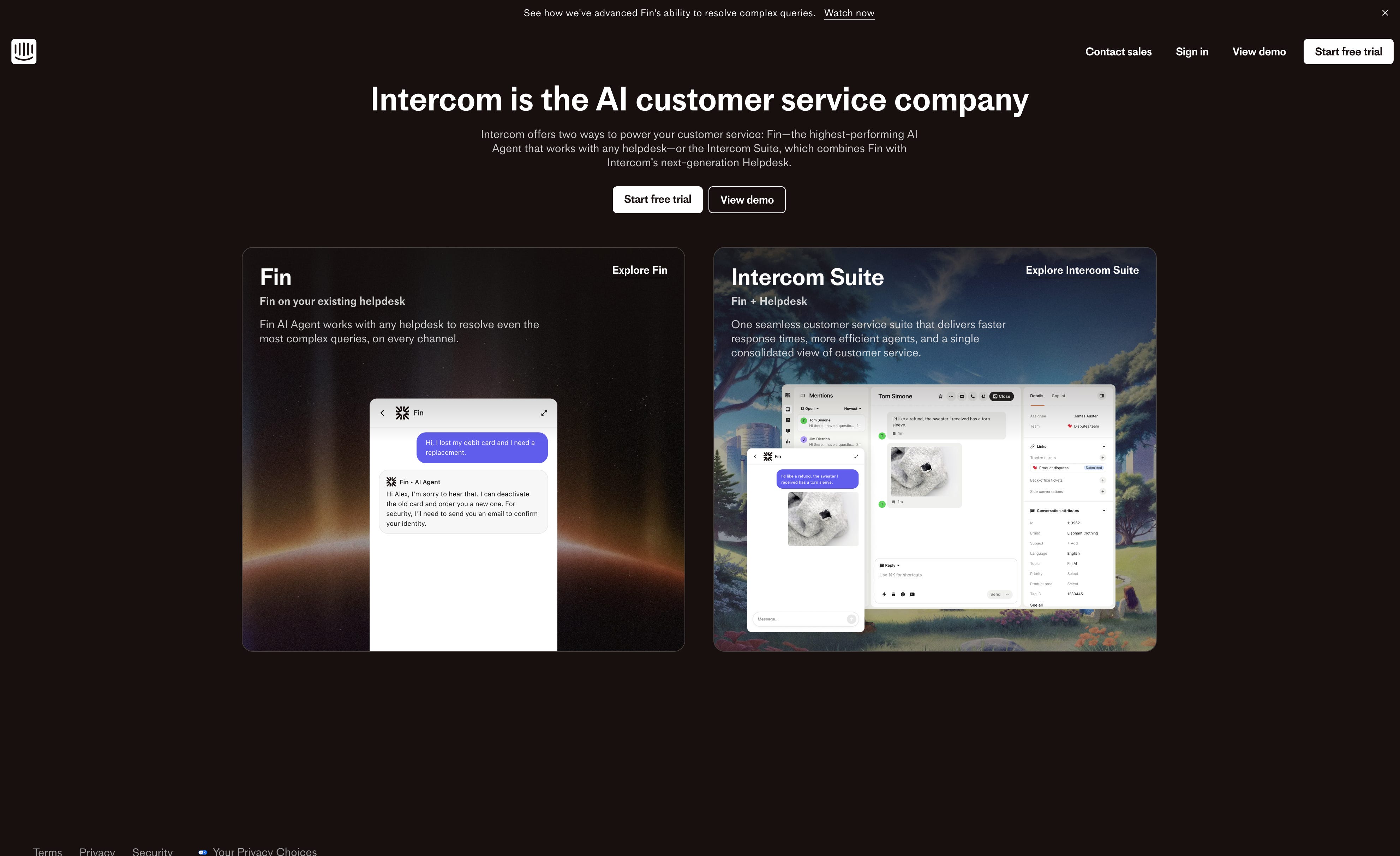
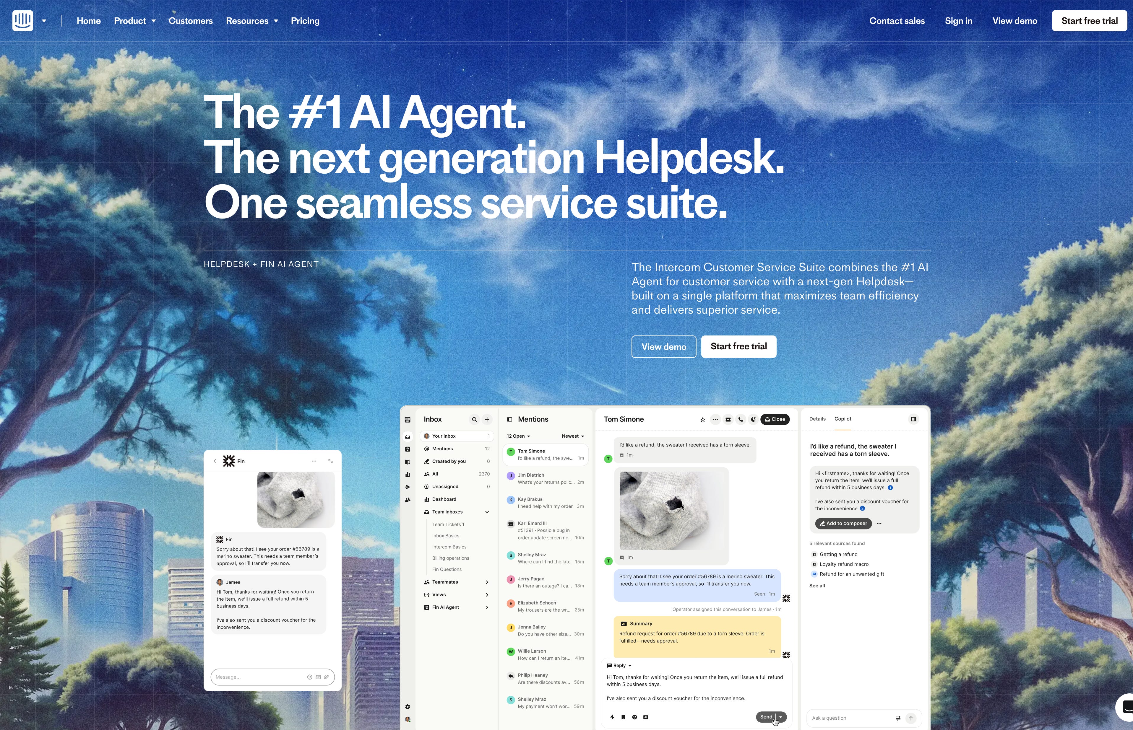
Intercom ran a parallel sequence. Their 2018 external rebrand produced a system that was, in their own published account, “all very theoretical until the handoff to our internal team.” Rules “weren’t applying and needed constant adaptation, leading to confusion and extra work.” The illustration style required an author present to replicate. Their published diagnosis: “building your brand around one single, specific, difficult-to-replicate element means your whole brand is in danger if the designer responsible leaves.” Three years later they corrected it internally: custom typeface by their own typographer, illustration system rebuilt for scalability, product visuals replacing expressive illustration.¹⁹
AKQA built a new visual identity for Miro in 2023, centered on a 3D illustration system produced by contracted illustrators.²² The system required original authors or close equivalents to replicate. Miro’s current homepage shows no trace of that illustration system. The yellow mark, the M, and the typeface remain. Those are the assets that predated both the 2019 Vruchtvlees rebrand and the 2023 AKQA rebrand. The expressive layer built around a contracted style did not survive operational pressure at 60 million users. The structural core did. This is a direct observation from miro.com as of March 2026. No internal account has been published. The pattern is the same as Intercom’s 2018 case, which Intercom’s own team documented: a single-author style, unreplicable without the original practitioner present.
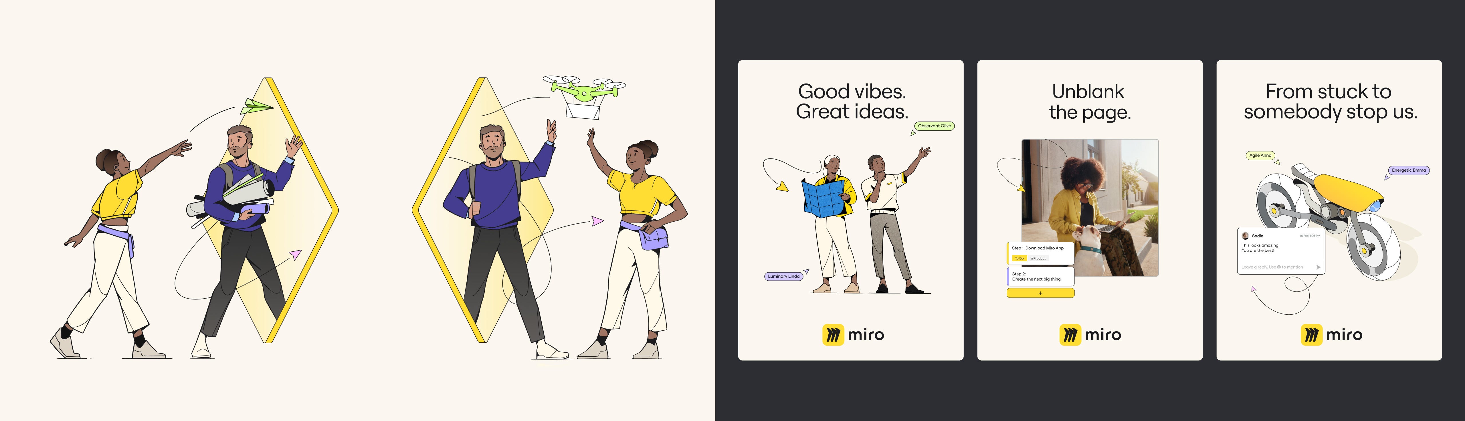
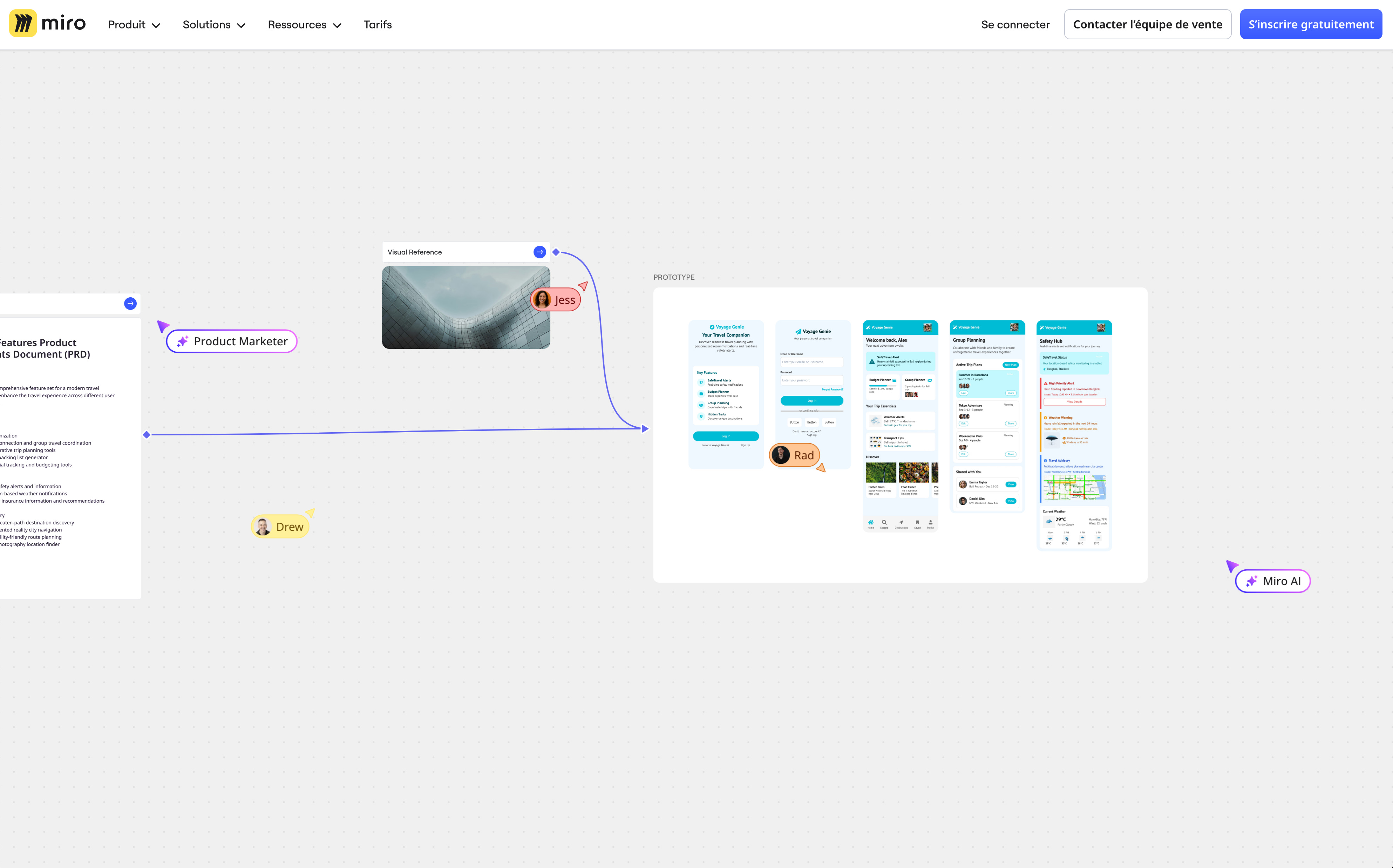
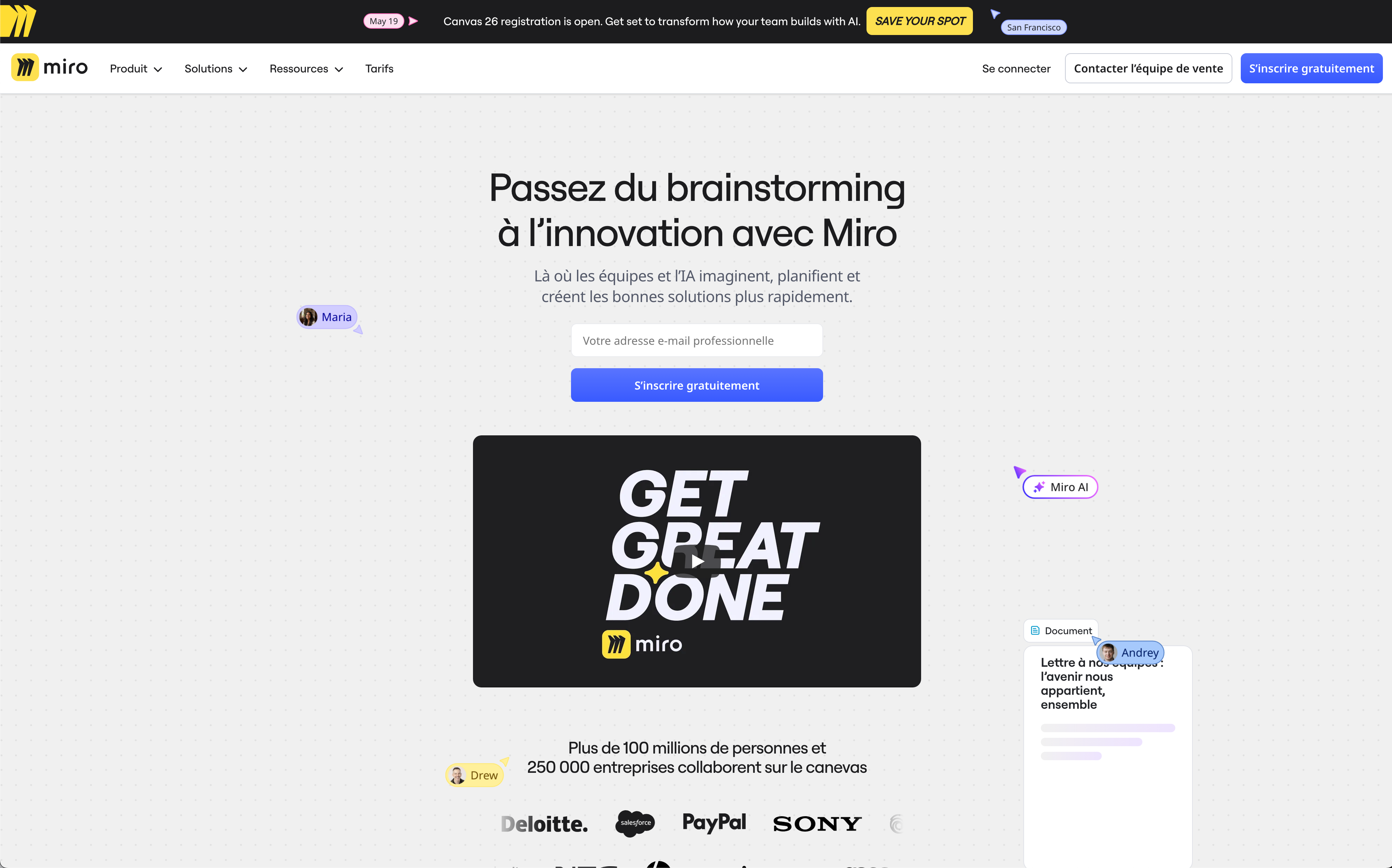
The pattern across all three cases is consistent. Each allocated significant budget to an illustration system that did not survive operational pressure. Each illustration system required the original author to replicate. Each was eventually abandoned. What remained in all three cases were the assets that predated the expensive layer: the mark, the typeface, the color. Structure outlasted art direction in every instance.
Systems Should Be Boring
A structural rule either governs correctly or it fails. The failure is legible to anyone with sufficient literacy. The cause is traceable. When a narrative system fails, the failure is absorbed into interpretation: the strategy was sound; the execution was misaligned; the audience was not ready. The causal chain cannot be isolated. Accountability disperses.
Narrative has a defined function. It governs people: the all-hands meeting, the onboarding document, the founder account. It produces soft constraints: tone rules, visual heuristics, pattern libraries. Those require a person to interpret them at every decision point. Marketing and advertising are the correct domain for narrative methodology. Both are designed to be interpreted by a person. Neither requires execution without an author present. What narrative cannot produce is executable rules: parameters a system runs without an interpreter present. The category error is not that narrative fails. It is that narrative is being operated outside the domain where it functions.
Where Identities Live Now
Olins built his framework for surfaces that existed in 1978: print, signage, built environment, employee behavior. Each surface had a production cycle measured in weeks. A creative director could review output before it reached the public. The model had structural weaknesses, but a finite surface count and slow iteration cycles meant a skilled interpreter could hold a system together through judgment.
The surface environment is now different in kind. In the United States, 88.2% of digital display advertising is purchased programmatically: automated asset selection, placement, and delivery at scale without a designer present at any decision point.²³ Social platforms each impose their own codec, aspect ratio, duration, and safe zone specifications. An identity system has to produce conforming assets across those formats at volume. Those are structural output requirements.
Product interfaces are generated from prompts constrained by design tokens. Figma’s MCP server applies tokens automatically to AI-generated code, pulling from a team’s existing component library.²⁴ The design token is the only mechanism carrying brand behavior into that pipeline. If the token is absent or wrong, the output drifts. The brand strategy document cannot be parsed by a code generator. The brand strategy and the design system are maintained by different teams with no shared language between them in most organizations. The semantic layer and the syntactic layer are not just misaligned. They are organizationally separated.
Every automated surface requires machine-readable rules. Narrative methodology does not specify machine-executable rules. The current surface environment does not make narrative governance expensive. It makes it inoperable.
The Structural Method
What remains is a research instrument: a process by which an organization’s structural coordinates are extracted before any formal decision is made, and the translation protocol that converts those coordinates into rules a system can execute without an author present. That process is the subject of the next essay.
Conclusion
The structural lineage runs from Moxon through Ulm to the cases documented here. The conditions that selected for narrative: agency economics, phase-based billing, holding company acquisitions, are documented above. In-house teams, design systems, and automated surfaces require structural rules because there is no author present to interpret.
A narrative requires an interpreter at every decision point. A structural rule requires only execution. Identity is what a system does without its authors present.
Notes
1. Gui Bonsiepe, “Visuell-verbale Rhetorik / Visual-verbal Rhetoric,” ulm: Zeitschrift der Hochschule für Gestaltung 14/15/16 (December 1965), pp. 23–40. guibonsiepe.com
2. Wolff Olins was founded in Camden Town, London, in 1965 by designer Michael Wolff and advertising executive Wally Olins. en.wikipedia.org/wiki/Wolff_Olins
3. Joseph Moxon, Mechanick Exercises: or the Doctrine of Handy-works Applied to the Art of Printing (London, 1683). archive.org/details/mechanickexercis00moxo
4. Robin Kinross, Modern Typography: An Essay in Critical History, second edition (London: Hyphen Press, 2004). hyphenpress.co.uk/titles/modern_typography
5. Anthony Froshaug taught at the Hochschule für Gestaltung Ulm from 1957 to 1961. See Robin Kinross, ed., Anthony Froshaug: Typography & Texts / Documents of a Life (London: Hyphen Press, 2000). hyphenpress.co.uk/titles/froshaug
6. The Ulm study began in 1962; the first corporate design manual was completed in 1963. See Jens Müller and Karen Weiland, A5/05: Lufthansa and Graphic Design (Zurich: Lars Müller Publishers, 2012). lars-mueller-publishers.com
7. The phrase appears across Aicher commemorative literature. See Markus Rathgeb, Otl Aicher (London: Phaidon, 2006). phaidon.com
8. The 2018 Lufthansa corporate design relaunch was led by Martin et Karczinski. The custom typeface was designed by Hannes von Döhren at HvD Fonts. hvdfonts.com/custom-cases/lufthansa
9. North’s Sean Perkins described the Tate in-house team as having struggled with consistency for years, citing 75 logotypes with no formal guidelines on grids, colours, positions, sizes, or formats. fastcompany.com/3061183/how-north-saved-the-tates-iconic-logo-from-itself | creativereview.co.uk/the-tate-logo
10. Wally Olins, Wikipedia. en.wikipedia.org/wiki/Wally_Olins
11. Wolff left the business in 1983 and Olins in 2001. en.wikipedia.org/wiki/Wolff_Olins
12. Michael Wolff, interview with Creative Boom, October 2024. creativeboom.com
13. “Omnicom buys Wolff Olins for £30m,” Campaign, 2001. campaignlive.co.uk
14. Wally Olins, Corporate Identity (London: Thames and Hudson, 1989); Wally Olins, On Brand (London: Thames and Hudson, 2003).
15. Wally Olins, The Brand Handbook (London: Thames and Hudson, 2008). amazon.com
16. Wally Olins, The Corporate Personality (London: Design Council, 1978).
17. Commercial Type, “Means, a serif typeface for Mailchimp,” 2020. commercialtype.com/news/means_for_mailchimp
18. “Intuit Mailchimp’s Creative Agency Wink Creative Named Ad Age’s 2023 In-House Agency of the Year,” Mailchimp Newsroom, March 13, 2023. mailchimp.com/newsroom
19. Scott Smith (Director of Brand Design), “Revealing our refreshed brand: How (and why) we’ve updated our look,” Intercom Blog, August 10, 2021. intercom.com/blog/how-and-why-we-refreshed-our-brand
20. McCann-Erickson rebranded as Interpublic Group in 1961, becoming the first marketing services holding company. campaignlive.com
21. WPP was purchased by Martin Sorrell in 1985 and began its acquisition strategy that decade. Omnicom formed in 1986 through the merger of BBDO, DDB, and Needham Harper Worldwide. en.wikipedia.org/wiki/WPP_plc
22. AKQA, “The future begins in Miro,” September 2023. akqa.com/work/miro/the-future-begins-in-miro The absence of the 2023 illustration system from current miro.com is a direct observation as of March 2026. No internal account has been published.
23. In 2024, 88.2% of digital display advertising in the United States was purchased programmatically. Insivia, citing Publift/Scaleo data. insivia.com
24. Figma MCP server applies design tokens automatically to AI-generated code. figma.com
(Written by Mitch Paone. Editing assistance from Claude Sonnet 4.6 (Anthropic). All sources independently verified by the author.)
Very interesting read. Thanks for sharing your thoughts!
A couple questions for you: 1. Can a serif typeface be used as a structural base for an identity? The successful examples you shared in this essay and in the past essays (Apple, Lufthansa, Braun, etc) seem to all use sans serif as a base for the identity. If so, are there any successful examples you can share? 2. Can an illustration system ever survive? Is this not possible because illustrations are too complex? Do they have to be simplified into iconography to survive?
Great piece, informative and insightful.