


In tech, a glaring misalignment exists between brand and product typography. You launch with a vibrant brand identity, expressive custom typefaces, and all the whistles and bells of the brand guidelines, but once you engage with the actual product, the system falls apart.
For the most part in branding typography choices are often dictated by fleeting trends rather than practical user interfaces, which inevitably lead to designs that falter in real-world user experiences.
Custom typefaces often get lauded on branding blogs for their flair, but in reality, most of them fall short. They buckle under the demands of tangible user interfaces, appearing too delicate, poorly spaced, improperly hinted, or simply unreadable at smaller sizes. Details that looked “expressive” in a presentation quickly become distracting in functional use.
Branding teams often develop bold and expressive type systems for presentations and launch campaigns. However, when these typefaces are incorporated into the product, issues arise. Product teams usually replace them with safer, more functional fonts, sometimes resorting to default system fonts. (Or google fonts... I see you inter!)
These failures aren’t just aesthetic. They stem from three core gaps: a lack of typographic education across both brand and product teams, a limited understanding of type as functional software, and a misalignment between expressive branding goals and the practical realities of interface design. When type fails in the product, the brand suffers, because the product is where users spend their time and experience the brand most directly. There is also a strategic layer: how typography supports a company’s growth and evolution over time. Can fonts and typographic systems be future‑proofed?
Refraining from an opinionated critique of all the brand ≠ product failures or referencing DIA work, the IBM Plex typeface, led by Mike__ Abbink, is a prime example of brand-to-product success in typography. Introduced in 2018, it has continued to expand and evolve, demonstrating the durability and adaptability of a typeface capable of carrying a global brand forward. It scales across the entire ecosystem, including product and marketing, at an enterprise level while maintaining a distinctive aesthetic signature that makes it own-able. It anchors the whole IBM brand at every touchpoint, and it is doubtful IBM will change this font anytime soon.
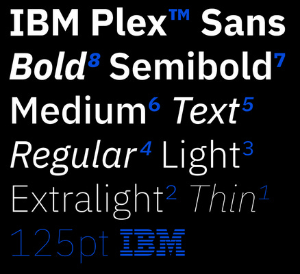
In functional scenarios, clarity, calm, and precision are essential; excessive personality is unnecessary. Subtlety and originality have their place, but they should only be presented with real skill. A typeface should enhance the interaction, not hinder it.
It’s a careful balance: creating a distinct signature while still supporting all design executions.
Aesthetics versus Technical Precision
Speaking from experience. I have designed 14 typeface families (11 available here), yet only one was conceived with user interface and product application in mind. Type design for this context requires an entirely different mindset. It involves spacing, contrast, optical sizing, hinting, and screen testing. Most branding-focused typography falls short wholly. It’s not just about taste or trends. It’s about technical precision, which demands significant time and effort.
Many people criticize the widespread use of sans‑serif grotesque typefaces in tech branding, calling them dull or overly utilitarian. Yet this uniformity often stems from function rather than a lack of creativity. These typefaces, rooted in Swiss modernism, prioritize clarity, neutrality, and structural balance. Qualities essential for fast, responsive, screen‑based environments. While there are plenty of humanist sans‑serifs that are excellent in their own right for this context, they’ve generally never spoken to me in the same way. (my personal preference to Swiss SBB’s Helvetica over the softer Dutch NS Frutiger)
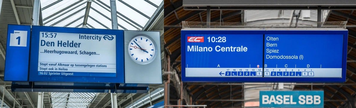
The real issue is that branding teams often seek an expressive personality using the same fonts that product teams depend on for optimal performance. In the tech industry, sans-serif fonts are not merely a visual trend; they are crucial. Their primary role is to integrate seamlessly into the interface, allowing the product to shine without overshadowing it.
Moreover, the design and production of these typefaces must be carried out at the highest level. While designers may concentrate on the letterforms, fonts encompass much more than mere shapes; they are sophisticated pieces of software. Today, with the advent of variable font technology, OpenType features, and global language support, this complexity has only increased. So much so that specialized companies like Alphabet and iKern focus entirely on the engineering and fine-tuning of fonts.
Every font must render cleanly across various operating systems, browsers, devices, and screen densities. It’s not just a matter of aesthetics; it’s about precision engineering.
Helvetica Refined: An Exercise for the Eye
Let’s examine the “Helveticas” for optical comparison as an exercise for the eyes. Helvetica is one of the most widely recognized typefaces in the world, and for good reason. Its lineage has shaped the visual language of modern interfaces, public signage, and global brands. But for many, especially those without formal training in typography, the various versions and reinterpretations can appear virtually identical.
Look more closely, and the differences become apparent. (even with the Linkedin image compression)
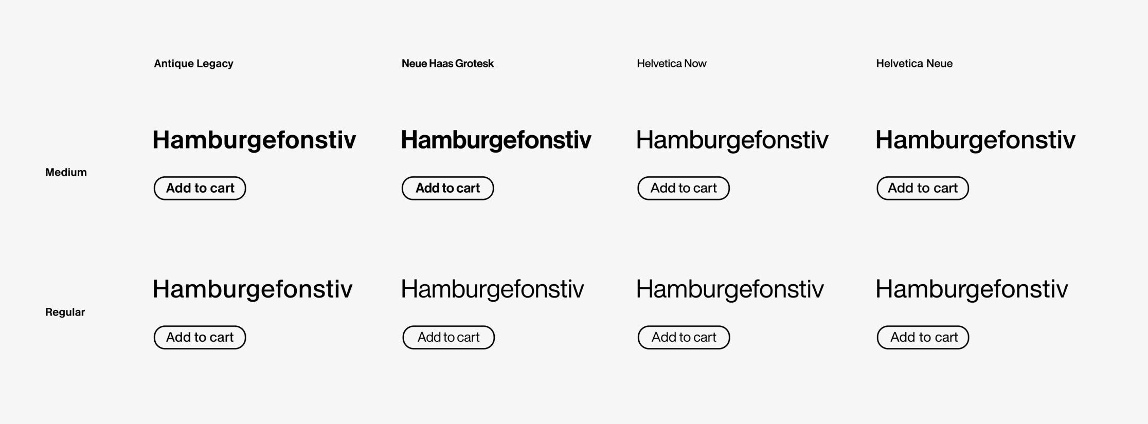
Compare Antique Legacy (Optimo) to Helvetica Now (Monotype), Neue Haas Grotesk (Commercial Type), and Helvetica Neue, and you’ll notice significant distinctions. The spacing, rhythm, proportions, cut thickness and tonal balance are each tuned in subtly different ways. I could write an entire essay about these comparisons, but I’ll spare you the details to stay on point. (yes we are just showing Medium and Regular! - interesting how different the cuts look - and take close note of the lower case ‘a’ & ‘s’)
In dense environments with fast interactions and varied screen sizes, those micro-adjustments directly impact usability.
Antique Legacy, in particular, stands out. It demonstrates a high level of technical finesse and screen optimization. It is not only more precise in its spacing and rendering, but it is purpose-built for clarity in digital environments. While it honors the neutrality and structure of its predecessors, it refines them in ways that enhance the product experience, not by design brief, but as a byproduct of François Rappo’s deep typographic expertise, taste, and precision.

My personal preference may be biased toward Antique, as Rappo is a frequent collaborator. Still, I think Neue Haas Grotesk is a close second, maybe less technically adapted due to its release date, but beautifully executed in its aesthetic interpretation of the original. (No coincidence it’s the logo and workhorse typeface for Verizon) (In comparison the default spacing is slightly too tight vs. Antique)
The Helvetica exercise utilizes arguably the world’s most utilitarian font, stripped of expression; yet even in this context, performance issues become apparent in the comparisons. Now imagine typefaces with greater detail and expression.
The Bigger Issue - Education Gap
Most product designers lack in-depth typographic training, and many brand designers also lack a strong foundation in type design. Product design programs typically offer a surface-level understanding, enough to build wireframes or choose a Google Font, but rarely go deep into spacing, rhythm, or scalable type systems.

Very few university-level graphic design programs include type design in their curriculum, especially in the United States. (There are notable exceptions in places like Switzerland and the Netherlands, where typography is treated as a core part of visual communication education.)
Without that kind of formal grounding, even experienced designers often approach typography with a limited toolkit. Brand designers may be highly skilled in layout and composition, but few have ever drawn a typeface or understand how one performs in complex digital products. This gap leads to superficial, trend-driven font choices, designed to shine in case studies rather than function in live systems.
Compounding the issue, many brand designers have not taken the time to study the rich history of type design, understanding when and why different styles evolved. Without this historical and technical context, it becomes difficult to critique, scale, or enforce typography in a way that supports both brand expression and product functionality.
And without that knowledge, from either side, how can anyone confidently lead a custom type project or select the right typeface for long-term use?
Books such as:
…should be mandatory reading for both brand and product teams.
Typography isn’t just about aesthetics. It’s about establishing cohesive systems that carry a brand into real interfaces, real screens, and authentic experiences.
I’d even argue that editorial design and product design should be part of the same typographic education. After all, both are about managing information hierarchy and guiding the viewer’s attention. The context may change, from page to screen, but the fundamental principles remain the same. (Setting aside interactivity, color, and motion behavior.)
Fortunately, it’s never too late to deepen your typographic skills. Here’s a list of schools, postgraduate programs, conferences, and workshops to explore.
Europe – Type Design Masters Programs
United States – Post Graduate Programs
Conferences & Independent Programs
Before You Commission a Typeface!
While design education will not adapt swiftly enough to close this gap anytime soon (this is a whole other topic of discussion), there is a clear path forward.
If you are commissioning a custom typeface and lack the necessary expertise, let the foundry lead the charge. Acknowledge their expertise and respect their process. Share your brand strategy, constraints, and goals, but then trust them to guide the design process. No mood boards! No trendy font choices!
Alternatively, invest in a type design consultant. Someone who understands both branding needs and typographic craftsmanship. This person acts as a translator, bridging the gap between the company, the creative team, and the foundry.
It’s not so different from a creative director guiding a composer. You wouldn’t give notes on notation if you don’t read music! You need someone who speaks the language, who can interpret vision into form without compromising technical integrity.
Successfully overseen several custom type projects in this capacity, not just as a branding or design firm, but as a type design expert. And I can confidently say: when trust and technical clarity are in place, the result isn’t just a typeface. It becomes core branding infrastructure across product, marketing, and every screen in between.
Top-Tier Recommendations
While I could provide a much longer list, here’s a focused starting point: designers I admire who have consistently created typefaces that meet the “Brand ≠ Product” challenge. This list prioritizes experience over hype, intentionally leaving out some emerging voices, not out of disregard, but because large-scale product and brand systems demand a level of craftsmanship that only comes with time and practice. (Oddly most not on LinkedIn)
François Rappo - (Antique Legacy) Optimo
Kai Bernau - (Atlas Grotesk) Commercial Type
Kris Sowersby - (Söhne) Klim Type
Laurenz Brunner - (Circular) Lineto & Source Type
Peter Bilak - (Fedra) Typotheque (notably the only humanist reference in the mix)
Tech Branding Beyond Typography
This article focuses on a specific issue: the disconnect between brand and product through the lens of type design. Solving this often begins with hiring the right experts and trusting their process, but it also requires raising typographic literacy across both brand and product teams. Without that foundation, font decisions tend to be surface‑level, driven by trends rather than real‑world usability.
Sometimes the most effective choice is no “brand” font at all. Consider ChatGPT or the pre‑”Chirp” Twitter: both rely on neutral system fonts that let the interface and content speak for themselves. By contrast, Claude’s more heavily branded type introduces a layer of personality that can feel at odds with the product experience and content it delivers. In cases where content and interaction are the primary focus, a restrained typographic approach can create a more seamless and trustworthy interface.
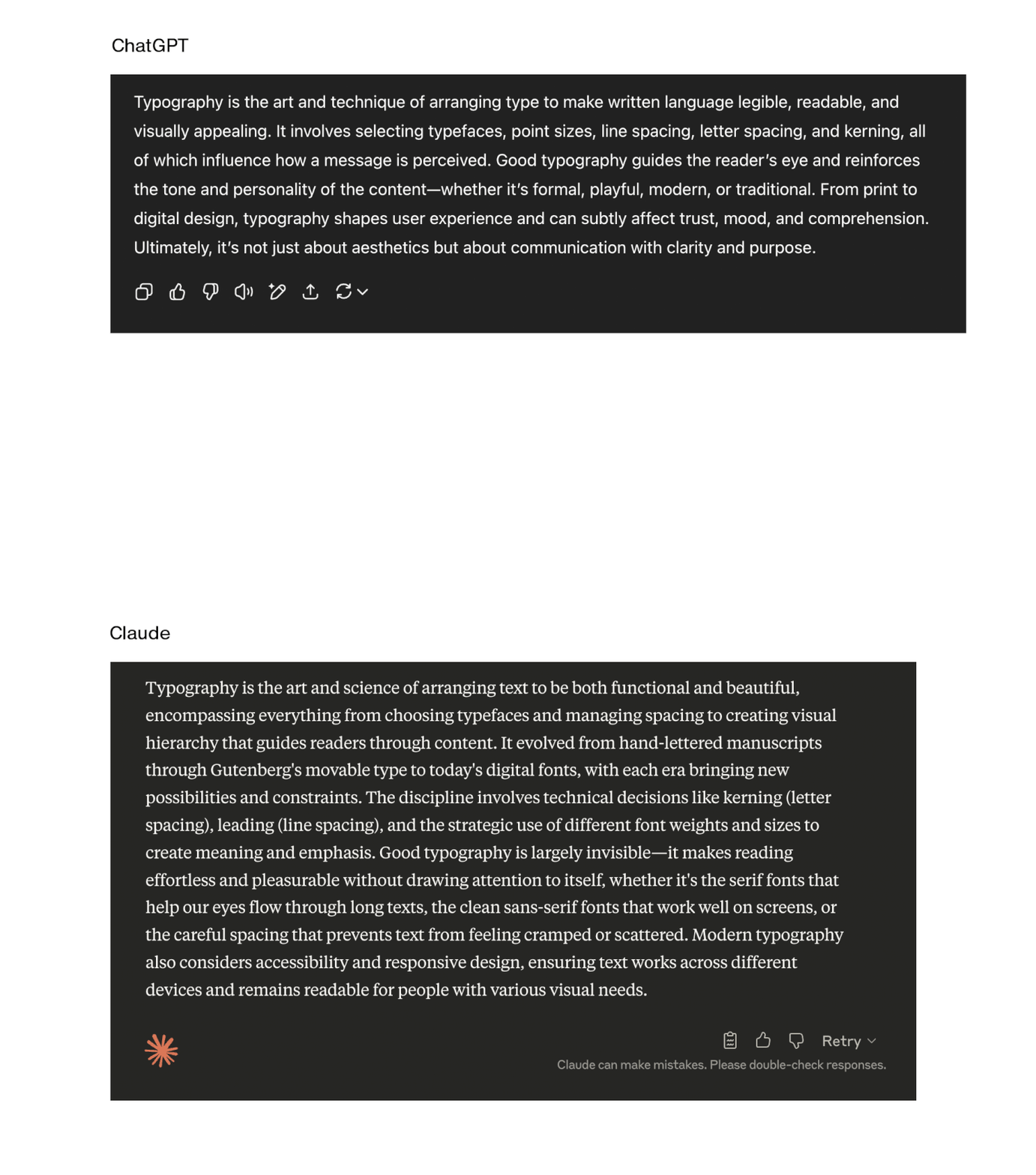
These decisions point to a larger strategic conversation, how a company positions its brand within the product experience, and how much personality the interface itself should carry. Typography is just one dimension of this alignment, but it reflects broader choices about identity, usability, and long‑term brand evolution.
Ultimately, typography & type design in tech is not just a matter of style, it is the backbone of brand and product alignment. The most successful systems, like IBM Plex, prove that when a typeface is engineered with equal attention to expression and technical precision, it can scale across years, platforms, and evolutions of a company without compromise. Brands that treat type as core infrastructure, rather than a fleeting trend, create durable visual identities that support products, enhance usability, and carry the brand forward in every context. In a landscape defined by rapid technological change, typography is one of the few tools that can provide both continuity and clarity, if approached with the craft and foresight it deserves.
Stay tuned for deep thoughts on design...
-Mitch
“Most product designers lack in-depth typographic training, and many brand designers also lack a strong foundation in type design. “
— agree!! and I would also say that product and brand design talent needs less narrow focus and more crossover holistically.